Your complete guide to Visual Brand Guidelines
29 Sept, 2022

A Visual Brand Guideline document can be a new business’ best friend, but it is so often non-existent in the early stages of setting up a new company – and often for long after, too.
It offers a roadmap for every single piece of content you create, from your brochures and your website design to your business cards and social media accounts. And without it, brands can quickly become inconsistent across their materials, creating a confusing and forgettable brand image for their customers.
So how can your business create a Visual Brand Guideline document?
What a Visual Brand Guideline includes
A Visual Brand Guideline should be a concise and easy-to-read document that covers everything someone needs to know to create on-brand content for your business. For example, you should be able to hand it to a graphic designer so they could use it to create any graphic piece using your exact brand colours, typeface, and style.
Here are the four key areas you need to cover in a Visual Brand Guideline:
- Typography
- Logo design with variations and correct usage
- Imagery style
- Brand colour palette
Typography
Your brand typography covers the fonts your brand uses. Typically, a brand will have just two key fonts, and a third in rare cases.
Keeping it simple with only a couple of fonts helps to ensure the full website and physical documents look sleek and professional. It also allows those two fonts to shine, as each typeface has its own personality that should reflect your brand.
Your Visual Brand Guideline should outline not just the brand fonts, but any variations (such as bold and itallicised), and how they are used.
Logo Design
Your logo should be a pared back visual representation of your brand. It is what your customers will come to know you by, so it needs to be memorable and it must provide some insight into your business’ personality.
Once you have a logo, it can even be a good starting point to build your Visual Brand Guidelines around. For example, you can extrapolate the colours and visual style in the logo to create guidelines for these areas.
In your Visual Brand Guidelines, you should clearly explain the logo and how it is used, including any variations.
For example, you might have a main logo, plus an alternative one to use in different formats. This could mean having a rectangular shaped logo for your business cards, website, and brochures, but making a square logo available for use in areas such as your social media profile (which often requires a square or circular image).
The guidelines will cover:
- minimum logo sizes
- Logo orientation
- Adding clear space around the logo
- Where and how to use which logo
Imagery style
Your imagery style should outline the general kinds of photos and images you use across your brand. This will primarily apply to your website, ads, and printed media. Your imagery style can be a little looser by definition in any social media posts you create, but it will still largely remain consistent.
For example, some brands prefer to use graphic design elements only – and no images of real people or places. Some brands use only elegant black and white photos, while others prefer bright, vibrant colours and plenty of smiling people in their images.
It can be hard to define your imagery style, so a good place to start is to create a mood board with random business-related images that stand out to you, and try to find a cohesive theme that runs through them.
Colour palette
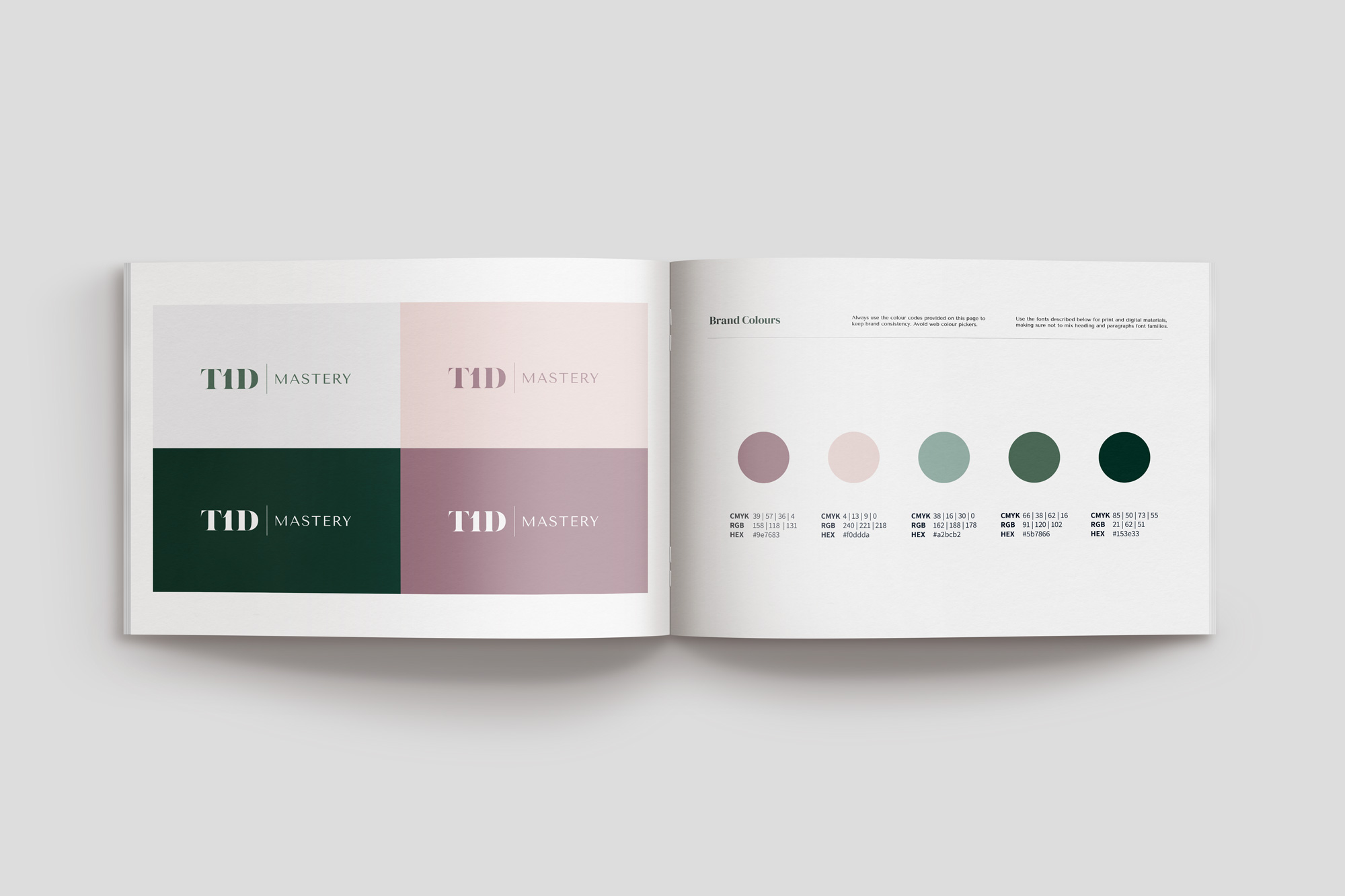
Last but certainly not least, your brand colours outline exactly which hues represent your brand. We typically recommend three as a minimum but no more than five, with a main colour and a key accent colour.
When you think of some of the biggest brands in the world, and even local brands, you can usually immediately think of their colours, even if you wouldn’t recognise their imagery, font, or even their logo. That’s why a colour palette is so important.
Your Visual Brand Guidelines must provide the exact colour codes. This means including your HEX code for online and digital materials, and your CMYK values for print materials.
Final Thoughts
You don’t need to be a multinational corporate to benefit from Visual Brand Guidelines. This document will help to keep your branding consistent across the board, which will help to make it more memorable for your audience.
It will also only become more useful as you grow and either take on new staff or work with contractors and freelancers who can quickly use this document to get up to speed on your branding.
If you’d like to put together Visual Brand Guidelines for your brand but would prefer professional guidance and help, don’t hesitate to contact our highly experienced team at CREATIVA.
