case study
Sequre Health
Branding & Website
About the project
SEQURE helps New Zealand’s hospitals reduce waiting lists for surgery and outpatient care by bringing experienced specialists and surgical teams to your operating theatres and clinics, after hours and on weekends.
Known as medical insourcing, the idea is new in New Zealand, being very successful overseas. This is the main reason that inspired the branding and website design: innovation, professionalism and excellence.Â
Project Goals
- Create a new professional logo and visual branding guidelines
- To reflect the brand mission and vision in their brand and website
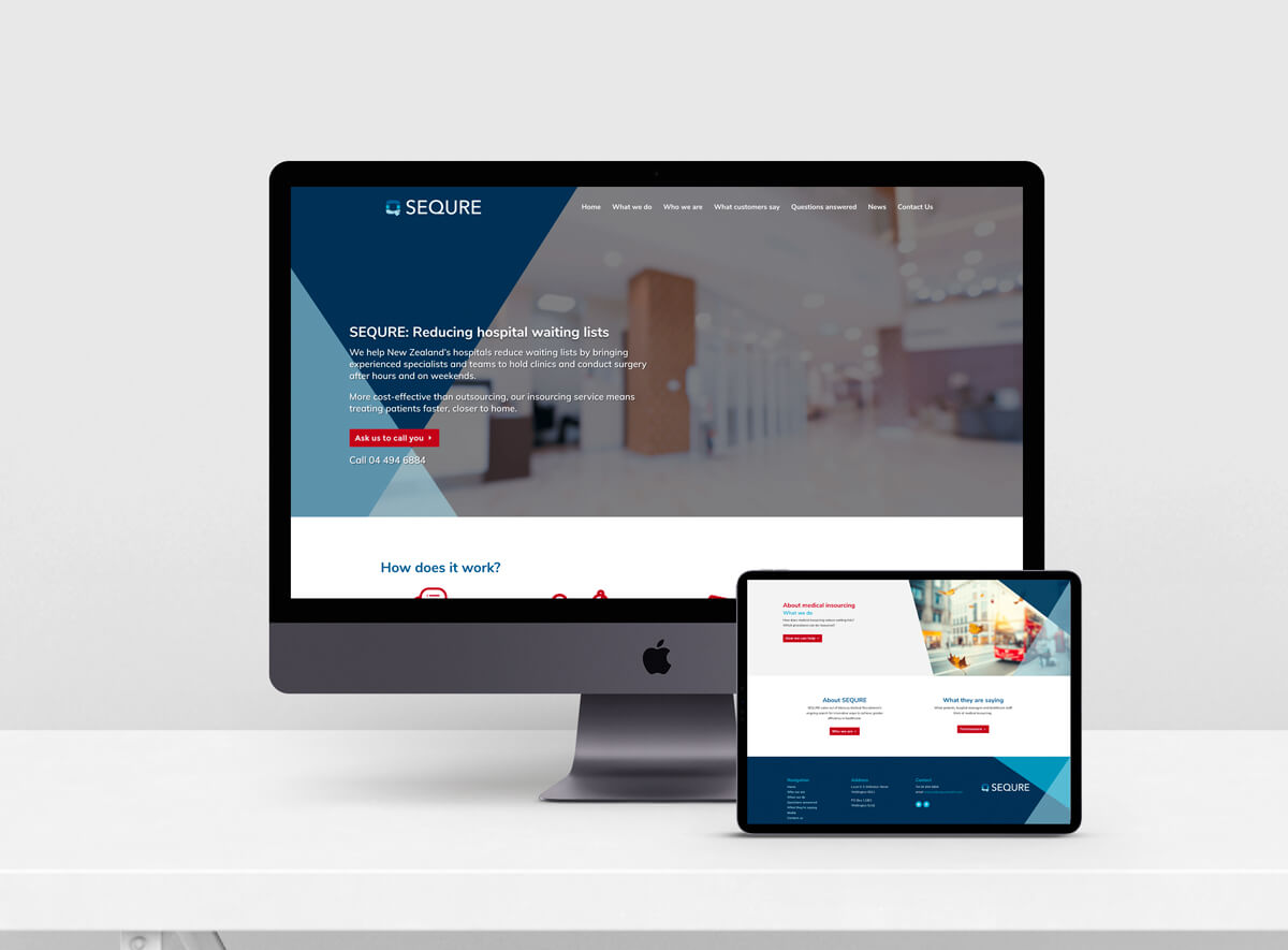
- Design and develop an easy to navigate and sleek website
Client Industry
Coaching
Published Author
Public Speaking
Deliverables
Branding
Logo Design
Custom Website Design
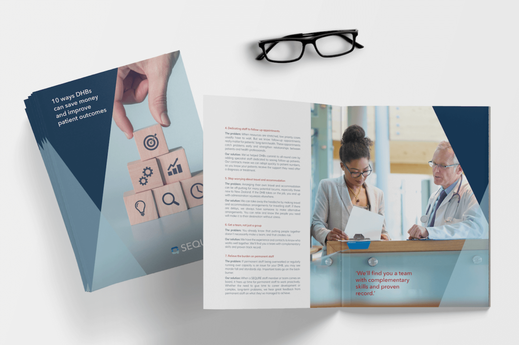
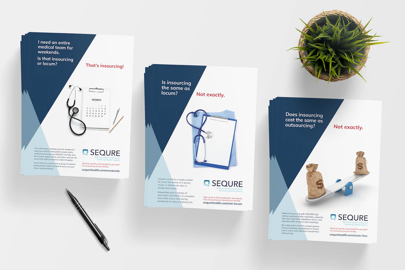
Brochures and Layouts
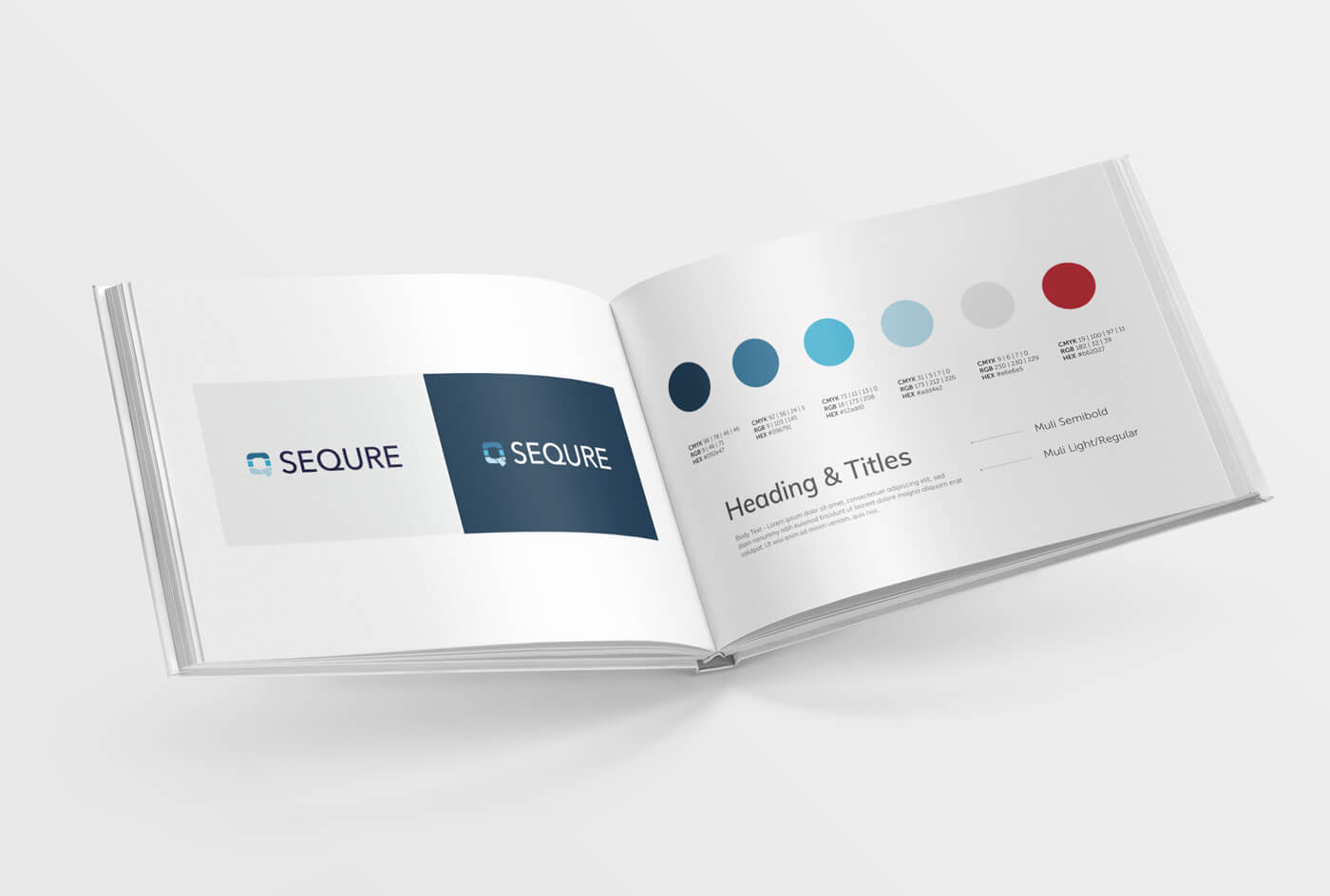
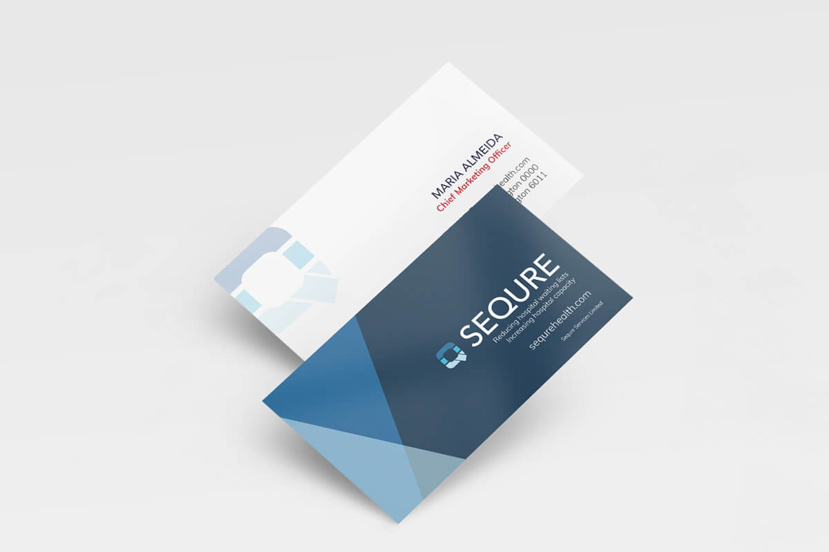
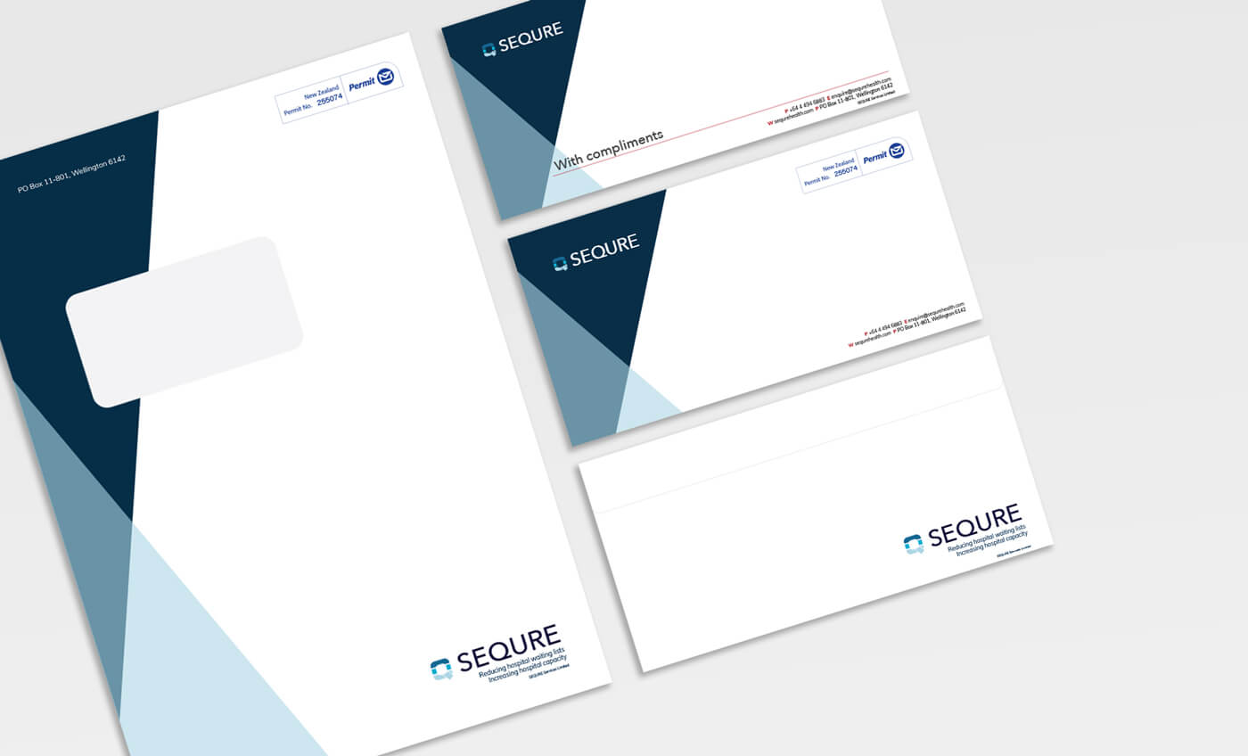
Logo Design & Branding
The logo design for SEQURE has very simple but strong style, focusing on some elegant and modern sans serif fonts and use the Q as a main symbol of the brand. The colour palette uses a few shades of blue, which plays through out the brand with a series of abstract shapes. There is vibrant red incorporated into the brand which is based on the double-decker London buses, a symbol that represents the basis of “doubling” your capacity.